
MIEMSS Website Redesign
2022
I worked with a team of engineers, developers, and the IT department in giving the Maryland EMS website a new look.
The Problem
The Maryland Institute for Emergency Medical Services Systems (MIEMSS) website had a number of issues. In general, content was not fluid and would break out of their containers when the screen width was adjusted, especially in tablet view. The content also didn't stack naturally with the adjusted screen width, and so sections would be squished side-by-side and go off the screen. The navigation wasn't accessible for some pages, some pages were broken, and content wasn't updated regularly. There was also no consistency in page design. Some department's pages had their own layout and used different navigation. Worst of all, we were using an old version of the Content Management System, DotNetNuke (DNN), and so the site was flagged for security vulnerabilities.
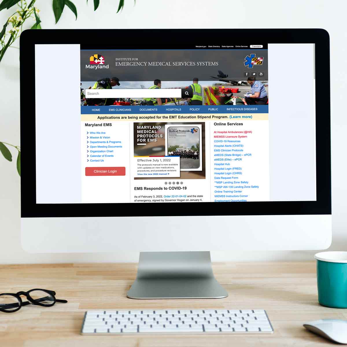
The Old Website
The old MIEMSS website had a lot of issues, not only in how it looks, but also because so much content was packed onto a screen and wasn't easy to navigate.
The Process
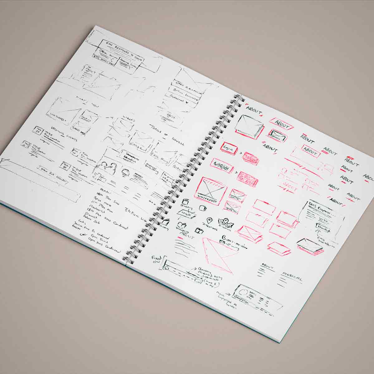
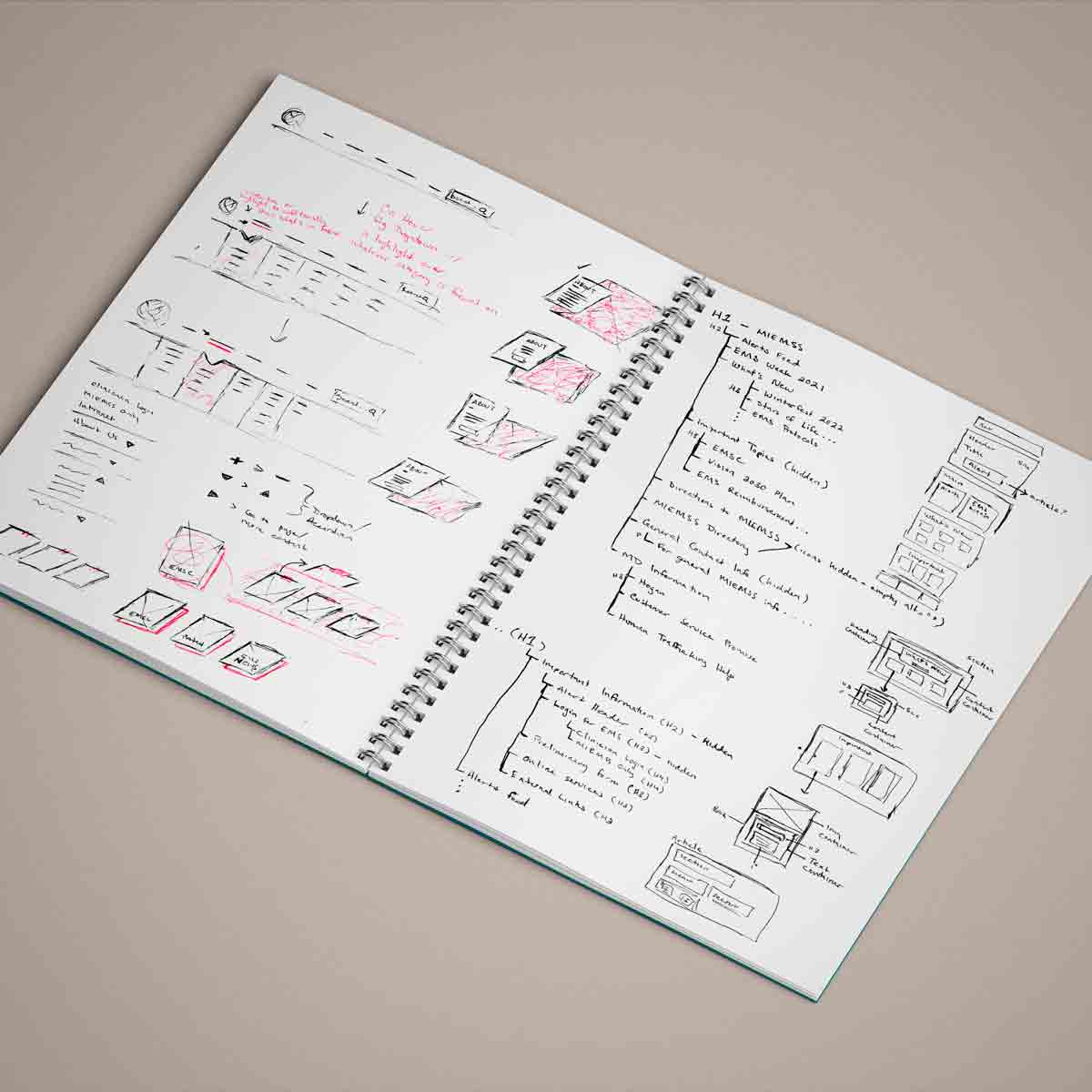
When I was brought on, they requested the website have a new look. However, beyond that, there were some functional issues with the website. I began with discussing the work the developers had done so far, and where we were looking for the website to go. From there, I produced sketches of web components, text treatment, and layout ideas, and brought those over into Figma, where I built a prototype.
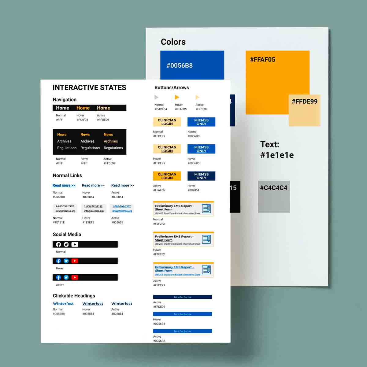
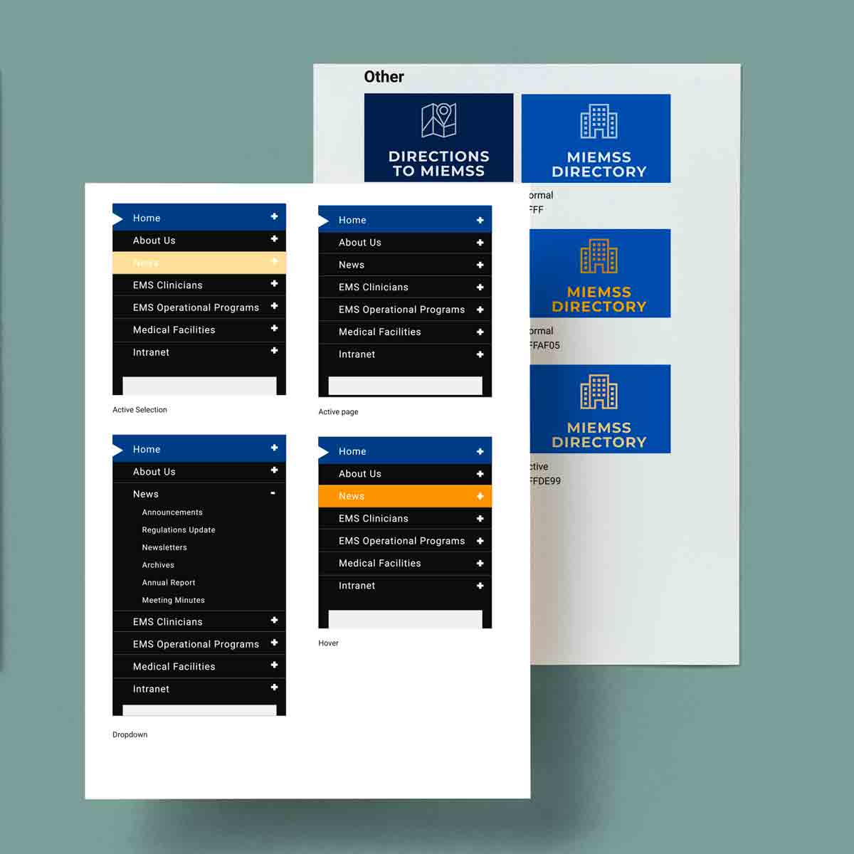
Revision Cycle
The prototype went under a cycle of review and revision between me and the developer I was working with. Color palettes and fonts were established, and we agreed upon 4 different templates; The home page, a 1-column page, 2-column page, and 3-column page for the inner pages.
The website protoype was then built in an updated version DNN. Links and documents were placed on their pages, and content moved over. During this process there were a number of glitches and other hiccups that occurred during the building process. This caused some setbacks which delayed the build process until they were resolved. The initial version can be viewed below.
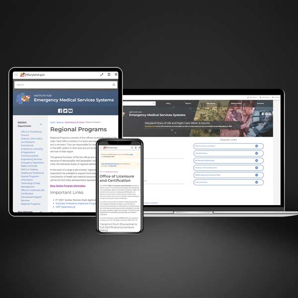
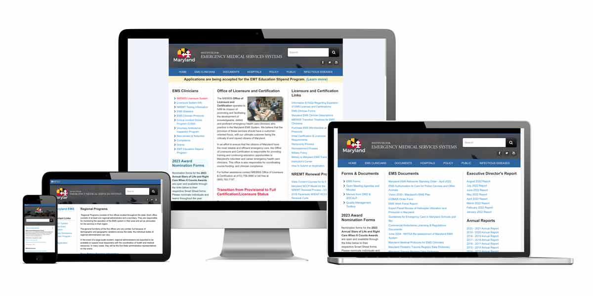
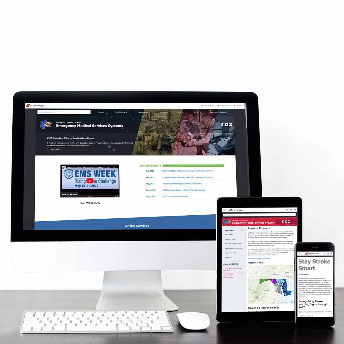
The New Website
Once the website was built, we presented it to the stakeholders (the IT department and the agency directors), for final review. The new website uses the latest version of DNN, which eliminated the security vulnerabilities present on the previous website. The look of the website has been updated, with larger text, more spacing, and an established hierarchy. Content is now responsive, and will stack appropriately depending on the viewport. I also worked with the agency's departments to go through their webpages and update the content as needed, so the site is active to outside viewers.
Lessons Learned
Going forward, if I can do this again, I would like to get the website off of DNN and onto a different CMS, like WordPress or Drupal. I would also create a documentation hub, where the designers and developers document what is being done for the site (style guides, components, widgets, changes, etc.). Communication was a big challenge, especially because I was brought on in the middle of the project, so I would definitely lay down boundaries, scope, and a timeline beforehand, and clarify who the players are in the project and what everyone's role is. User research was also an area that could be improved. Very little data was collected about the website; who visited it, the web traffic, what areas need improvement, and so on. This muddled the development process because it was not clear what the major issues were that needed focus.