
Horizon Apartments
2022
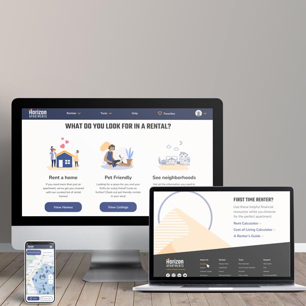
A small website built in Figma of a fake Apartment finder site.
The Prompt
THE APARTMENT PROJECT: This site helps renters find a new apartment. Design an application that allows users to search for apartments in a specific area (or multiple areas), define criteria, and filter the results. In this case, a user wants to search for an apartment in a specific area, refine the results by a set of criteria, view the details about an apartment, and initiate contact with the owner.
RESEARCH AND PREPARATION: Before getting started, I took a look at several apartment finder websites, like Zillow, Apartments.com, Trulia, and Rent. By taking notes and screenshots on the type of information they provided about apartments, how components were laid out, and other details, I was able to get an idea of how I should go about designing my application.
User Flow
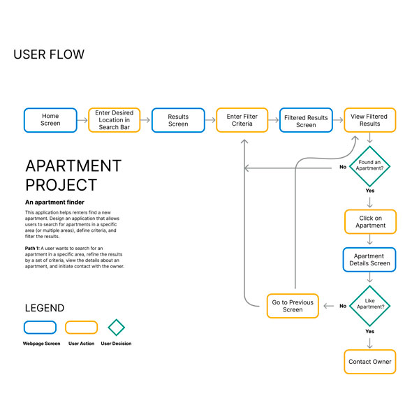
To get a feel for how a user might search for an apartment I walked through the process using Zillow and Apartments.com, pretending to be the user for my specific scenario, and made notes of the steps. I wanted to keep the flow as simple and specific to my particular case as possible. There are many other branches a user could take, even for my scenario, but I felt that would muddle the flow chart and distract from the overall goal of the project.
The Wireframes
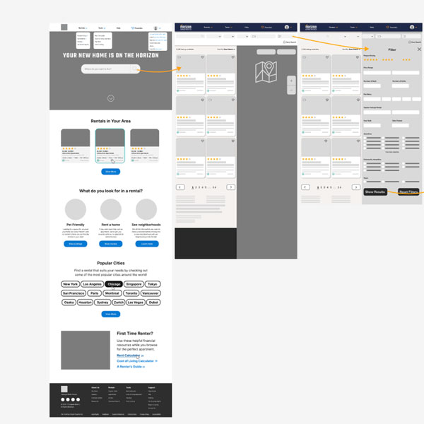
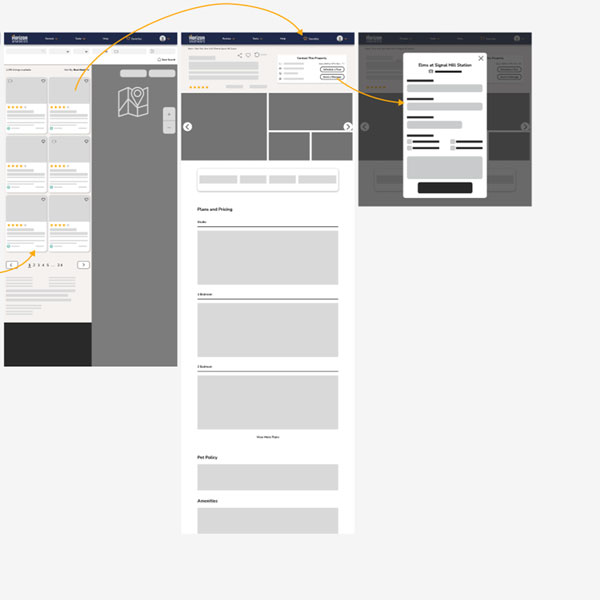
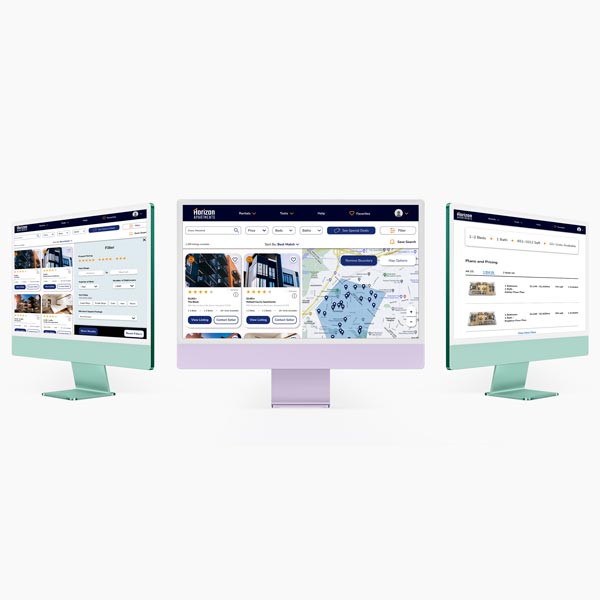
The wireframe flow shows the process of searching for apartments in a specific location, seeing the results, filtering results, seeing the details of one apartment, and finally, contacting the owner. Both the map and the filter form are meant to be at a fixed position, and so the user will scroll to see more apartment results or see the rest of the filter form. I didn't show the rest of the landing page or apartment details screen, because the user flow primarily focused on the buttons at the top.
Style Guide and Logo
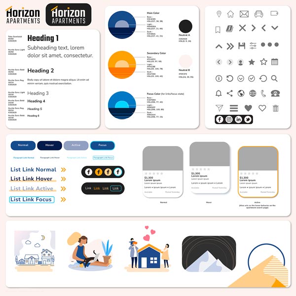
My main two colors, purple and orange, came from a photo of the horizon during sunset. The blue is specifically for paragraph links and focus states since it's noticeable against the other colors. I used WebAim and a colorblind checker to ensure my main colors are accessible. I wanted an industrial-style font for my top headings, so I chose Teko, and then Nunito because its rounded, open letters counter that.
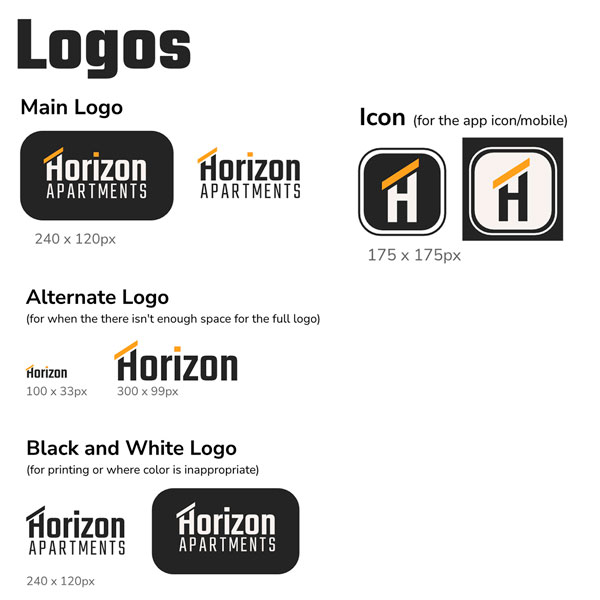
I've created logos for various situations: regular/desktop, mobile, printing, and perhaps even for various stationary purposes, such as envelopes, letterhead, etc. The main logo and icon logo would be used the most frequently and the other two versions are exceptions for specific use cases. They otherwise aren't necessary.
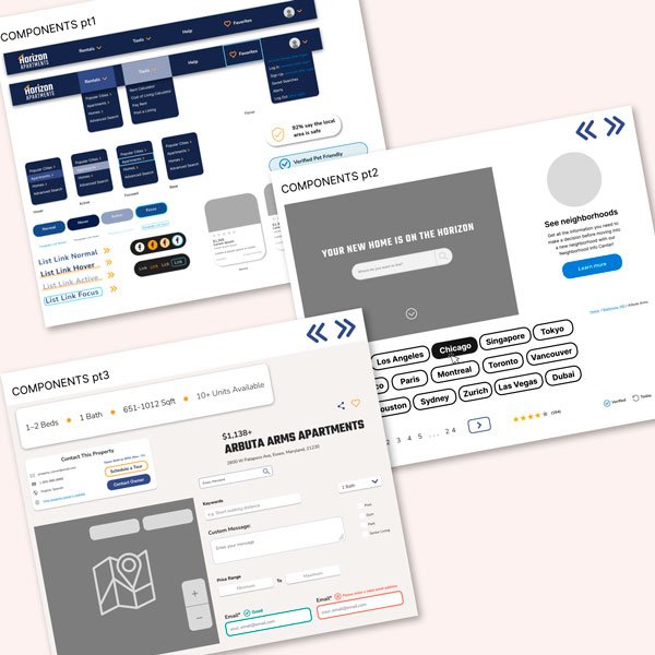
Designing the Landing Page
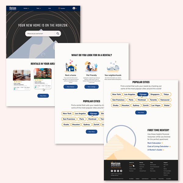
The mice are there to indicate state changes (either hover or active state) for clickable items where it isn't otherwise apparent that the item can be interacted with. The most difficult part was deciding which pieces of information would be most important for a rental listing, as well as narrowing down what options a renter might be interested in on the home page.
Other Screens
I struggled on deciding what content to incorporate and how to lay it out. Viewing different rental sites, there's a lot of information on the search results and details screens, which felt like too much.
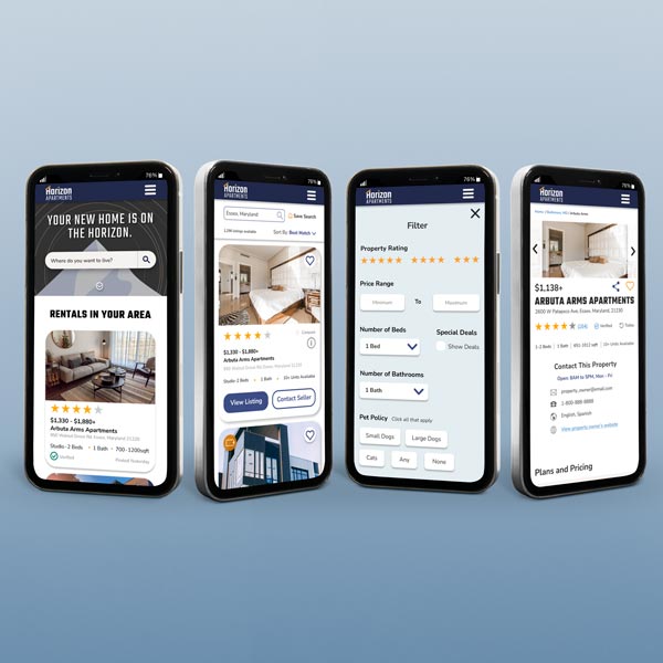
MOBILE VERSION: I moved my content to keep it 1-2 columns. The map screen looks weird, because in prototype mode, you can move the map around to replicate how it would be in reality. The other elements on that screen are fixed. A lot of content has been hidden behind accordions to save on scrolling and certain elements are now fixed so that users always have access to those buttons.
Prototyping
The final prototype replicates the flow the user will take.